Crafty, smart and eloquent Call – to – Action button is capable of strategically guiding you through the website to complete certain actions – from buying the product or filling in the sign-up forms.
As simple as that.
All those newsletters that you erase every 10 minutes were there because you clicked on a nicely placed buttons, just for you. All those apps that you have, are also clear evidence a clearly striking CTAs.
So, what is the secret of the successful CTA buttons?
In a balance of an attractive, simple design and “stick out like a sore thumb” kind of copy.
Some are of the opinion that you only need to put anything that WILL CALL for action in any shape.
If only.
The effectiveness of call to action buttons lies in your good predictions between simple and effective design and copy.
So, whether you are a designer or a marketer when it comes to a CTA, you should think of yourself as a social psychologist. Your priority is to find out how people in your niche think and behave.
Here’s what you need to consider when creating call-to-action buttons:
In a nutshell – the entire purpose of the CTA buttons is to get visitors to do something.
Achievements could be different, whether you want your users to fill the sign-up forms so you can build an email marketing base, or you want them to click the “buy” button.
In the end, buttons appearance have the same recipe.
What would be the best CTA button?
Here is what you need to know.
- A simple yet effective design
Nothing revolutionary isn’t necessary for good CTA buttons. Have in mind that bigger is not always better. Don’t oversize it. Huge CTA buttons can look pushy and unworthy so you will drive the users away.
CTA buttons can be of a different color, defined shape with borders and text somewhere in the middle of it. You can add edges, but you don’t need to.
- Remember, CTAs are not the place to unleash your creativity or try setting any new trends. After all, we are talking about the world of conversion optimization.
Instead, add some more visual cues to guide the attention of the user. Arrows around the button can draw extra attention and improve the conversion.
Or, think about clean and straightforward design such this one at HubSpot.

- Think red, think orange, think in contrasting colors!
Contrasting the color of the button is what makes the CTA button efficient.
CTAs come in the forms of buttons. We see a button; we know what to do. Make your CTA button a button. David Yheng, Crazyegg.com
They stand out if not for copy than for colors, and people will notice them. The action might differ, they might ignore or click on the button, but they will notice it.
- A click-worthy copy
We are talking about the most compelling copy.
Effective CTA button is not only about the color, size, or placement, but a good copy.
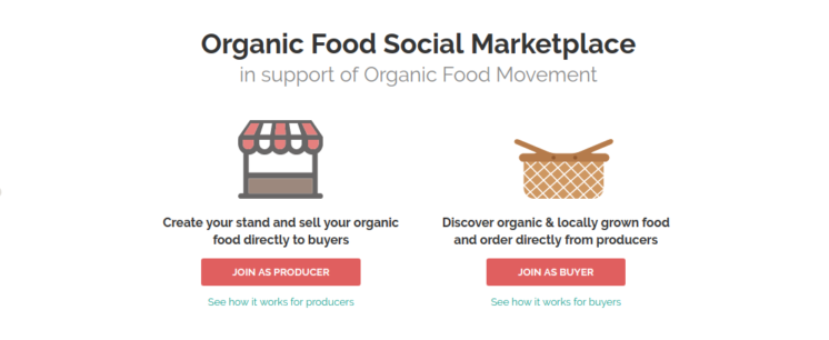
Check out the example from our startup’s OrganicNet landing page. We use simple but most lifelike words that brings what you need if you are the producer or you just want to buy organic food.
- Copy of the CTA button invites users and visitors to perform a certain action, and you need to think about the verbs that are as simple as ABC.
Think about your business and determine how you want to build relationships with your users and visitors. Would you use the possessive determiner “my” or “your”, there is a big difference.
For example:
- “Start your free trial”
- “Check your discounts”
- “Download your free e-book”
What is more important – make sense of urgency. Use words such as “Now”, “Today” and “Last chance” that can boost your click through rate (CTR).

Audible is an interesting example. They create a sense of urgency in a subtle way. You can try Audible for free, which is what the button states. If you want more features, you can try the service for a month for a certain amount, but you can cancel anytime. It’s a fair offer and the copy is inviting, not intrusive.
Afterall, we all love free things.
Where should you place the CTA buttons?
CTA buttons provide help by presenting a solution to users with a problem.
When you make a clear statement what would be the benefits for users if they complete an action, you provide value to both your readers and your business.
If you are creative and smart, you will effectively place the essential information in the right visual place, but, if you don’t direct the focus of your visitors to what they need, they will leave.
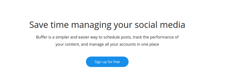
So take a look at what Buffer did. They add a simple CTA button right after the description of their service, focusing on HOW they can solve the problem for you if you sign up.
That’s why you need an effective CTA button – to help the users focus on what is relevant to their business. Visitors are here to perform a certain action, and you need to make sure they can find what they need.
- That is why you need to think about the user’s journey of a user on your website.
Try to fit the CTAs in their logical placement. There is no correct solution, only suggestions, and your own testing. Use buttons whenever possible, people are visually oriented creatures.
Find out which elements of the page draw the most attention of the user, think and predict it.
Why do people want to click?
There are plenty of reasons, and we will sum up the most important ones.
– They click because they are already there, engaged in the process. They’ve invested time to search your website.
– They are more than curious to see what you offer or what answers you have.
– They click because it’s free and does not include much effort to do that
– They are simply excited to do that
Use that to your advantage!
How can you check the effectiveness of CTAs?
- Conversion is your final goal
Buttons are what makes people click. Once they click, they convert. Don’t over complicate.
The common mistake many website owners make is combining several activities within a call to action on one page.
However, this will not only confuse a visitor but also decrease the conversion rate.
Sure, there is no scientific data that show how CTA buttons actually work. You can follow other examples with the best practices and adapt them to work for you.
Test, and again test, only then you ‘ll know if they work for your audience.
So, to sum up…
What is the ideal CTA?
– Should be easy to spot. So, contrasting color and clear shape of rectangular or any other form.
– Copy should come across as a simple but actionable phrase or verb.
– The right place for CTA buttons will contribute to a high-converting landing page.
But remember, CTA buttons are just one of the ingredients you use to turn visitors into users/buyers.
If you want the whole package of conversion, don’t stand upon only CTAs but consider and analyze every aspect of your business and website.
