
Purpose of effective elearning platform design is to enhance the functionalities of the website.
The goal is not only to make websites visually appealing and attractive to the eye but to keep users coming back and increase conversion. Design elements have to provide a thoughtful, useful and interesting experience for your customers.
Only a satisfied user will return, stay longer and eventually purchase your product or service.
Sync all design elements for the best e-learning experience
The rules of good UX design are the same regardless of the project or industry.
Before you start designing or redesigning, get to know your users, their needs and habits.
Why?
Your design needs to …
- Attract users to use your e-learning platform
- Provide a smooth and easy navigation
- Make browsing the courses/lessons stress-free
- Ensure the micro-copy and messages are clear and simple to understand
- Make CTAs effective and conversion-friendly
- Ensure users’ learning curve is acceptable
Ready to learn how?
We will guide you through the process of understanding the elements of effective design.
8 Smart Tips for a eLearning Platform Design
Our product designer Danka Đurić will share her experience and explain to you the elements of design for e-learning platforms and corporate elearning solutions.
She will go through the trends and good practices of using proper graphics, colours, and images and other design elements.
#1 Composition in elearning platform design
We could say that composition is one of the most important elements of an effective and smart design.
It has many aspects, from symmetry, pattern shapes, and contracts to balance and texture proportion.
When you create a website, to attract your perfect user, you need to create its area of focus.
Did you know that images are an important part of the customer’s decision-making process?
Some research indicates that increasing the size of the image may change the eye path and increase sales. Other papers explain that when you feature someone’s face, the sales department will increase the number of closed deals.
Where you place the video, an image, or a CTA button matters.
Why?
All together these elements are there to grab the user’s attention.
ED: What would you say is a dominant element of effective design for elearning platforms?
Danka: From my experience, featured images of the courses have been shown as dominant and the most important. Besides drawing the attention, their purpose is to make browsing the courses trouble-free. Learning is what users are coming for, and with these images, we have to leave the strongest impact and provide information.
I would suggest choosing images with high quality, calming but intriguing and closely related to the subject. The focus has to be on the subject of a course and images have to display clearly what a course is about. Otherwise, users will leave.
That is the reason why a proper image can be such a decisive factor for engaging and keeping users.

for our project, platform Procurious
#2 Layouts and hierarchy of the elements in the elearning platform design
A proper layout is another element of an effective design. When you consider a specific layout for the e-learning platform, the goal is to create a thoughtful experience for your user.
There are many factors that contribute to a good layout, from the size and position of videos, and the place of the CTA and login buttons, to a spacing of elements and shapes you chose.

Layouts create a harmonical hierarchy of the elements and give visitors what they came for.
In turn, they will most likely reward you with some type of conversion.
ED: Which pattern do you use to organize the elements on e-learning platforms?
Danka: I have no doubt that the best way to organize elements for the e-learning platform is to make them symmetric and aligned with each other. This system allows a user to perceive the content instantly.
Designers will agree that asymmetrical and other vibrant elements are more useful for different illustrations of the courses.
Courses, content and important information on the other hand, have to be in blocks that are symmetrical and consistent on each page.
Only this system makes a website more user – friendly and easy to navigate.
#3 Order with grids and alignments for the best UI
In web design, the grid serves as a framework in which a designer can put various content and elements.
Aligning elements when possible contributes to a sense of order and allows the eye to move naturally through a layout.
In other words, the grid system allows you to organize content in a way that will certainly attract users to stay longer on the site.
ED: The hierarchical or modular grid for e-learning platforms?
Danka: I would choose the ‘modular grid’ for e-learning platforms. This way of elements composition divides the layout into the straightforward columns and lines and have modules with proper dimensions. This type of grid is common for e-commerce websites as well as for social networks.
Instagram has a modular grid and it is perfect for browsing images.
On the other hand, the ‘hierarchical grid’ is the best for the composition of the courses. This grid organizes courses based on their values, views, interest, etc.
The best examples are around us and we can all reflect on what we had in our school books. They all had a very clear modular grid in the combination with hierarchy and we intuitively knew what is important to learn. The same is applied to the web.
However, I would suggest taking the best from both.
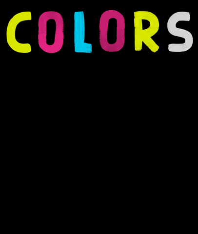
#4 The psychology of colors in e-learning platforms
Many chapters of the research papers are dedicated to how colors impact our purchasing decisions.
Coca – Cola, for example, took red as their brand color. Red is an emotional and warm color that suggests comfort. It is perfect to be related to food and drinks.
The same concept of color influence can be applied in the learning industry. You need colors that invite people to react, welcome and comfort them so they subconsciously know they are in the right place, doing the right thing. ED: Why do designers choose cheerful and calming colors for e-learning platforms?
Danka: Cheerful and bright colors motivate users to act quickly. These colors “transfer energy” and willpower to a user, stimulating him or her to see something important, learn something new and eventually purchase a course.
Design colors for e-learning platforms have to be chosen based on the topics, type of users, their age and experience.
A primary palette of chosen colors has to encourage motivation. Orange is sometimes the best choice for inciting proactive behavior because it is perceived as a color of optimism, and a symbol of communication.
Yellow is also cheerful and positive, and it could make dull content more interesting, though you have to be careful with the shades of yellow. The brightest ones make the content unreadable.
Red is powerful for highlighting the most important content. However, red is the most visually attention-grabbing color so use it carefully in your design.

Green and blue are your safest choices. I would always go with green if there is a compatibility with a platform’s purpose. Green is motivating but calming and recalls the colors of nature and prosperity. Thus, it can be related to learning and progressing. Blue is also calming and trustful.
Keep in mind that users who are visiting e-learning platforms are often insecure and anxious as they will test their knowledge. Therefore, use your design and choose smart colors to help them get over that unpleasant feeling.
#5 Secure good UX with the White Space
Make sure your layout has a white space so the eye has the opportunity to rest from the colors and lines. If such relief lacks, visitors tend to leave faster from the site and you will lose a chance to turn a visitor into a user.
ED: What is the purpose of white space on e-learning platforms?
Danka: People visit e-learning platforms because they are looking into new ways to learn and gain new knowledge. This should always be in your focus and be the focus of your smart design.
Still, learning is something that is already challenging for users and designers have to simplify and ease that process as much as they can.

Take reading as an example. Mobile devices provide us with different ways in which we can acquire knowledge. Reading, however, requires significant effort. Our eyes can quickly get tired. With white spaces, we can solve this issue. When we use it properly, we can make the learning process easier and prevent visual stress. Users (readers) will appreciate that.
#6 Use contrast to bring life in flat design
Contrast turns dull websites into attractive and engaging projects. The contrast in design is efficient and useful. For many web projects, contrast can make or break the deal. Effective contrast design can be achieved through colours, type styling and how they are lined.

ED: How would you use contrast to attract users?
Danka: Contrast is a vital and effective element that makes an entire hierarchy of elements much clearer. When designing for e-learning platforms, different types of content should be in contrast, while the most valuable information is highlighted.
Without good formatting, users will find the content (and the website) dull and unattractive, which will draw them away.
My recommendation is to use element spacing to achieve contrast. For example, if we add twice as double white space around one element, we will draw more attention to it. That can be used to highlight any displayed graphic or text.
Still, the most obvious and effective contrast can be achieved between black and white and other brighter colors. If you choose the shades of the same color, you can create a good contrast. This applies to any text or background as opposed to the main content.
#7 Improve readability and engagement with fonts
For most websites, type styling is based on current trends. The choice of fonts and type styling has a huge impact on the user’s decision to stay and learn on your e-learning platform.

which may inspire even more readings and conversions.
Source: Giphy
After all, the choice of italic or roman, normal or extended, weight, and color contributes to the readability and perception of hierarchical information. Luckily you can always check and compare fonts that are out there.
ED: Which type styling is preferred for e-learning web design? How do you decide what type styling is best?
Danka: When you choose fonts, make sure they are readable and already familiar to users. Sans serif fonts are often the choice because they provide satisfying readability.
Go for fonts such as Brandon Grotesk, Futura, Roboto, Lato, and Monserrat which are also highly readable and many designers will choose them for any type of eCommerce or e-learning platform.
You can also try Nunito. It is a warm and friendly font with rounded edges that still looks professional and readable.
The minimal size of the fonts for the main content shouldn’t be below 12px. Other sizes, such as 14px or 16px are included but that depends on the type of a chosen font.
Source: Giphy
Paragraph width also matters, and 500 – 700 px, or 75 characters, is recommended. Use Italic and bold as styling types only for highlighting. Once you set your choices for one type styling, use it consistently on the entire e-learning platform.
Of course, don’t get too freely with fonts and don’t go over with sizes. Serif fonts are great for headings but not for subheadings. Still, that is another way to achieve an interesting contrast, you should try it!
#8 Place CTAs naturally for the efficient user journey
Once you’ve captured users’ attention, it is important to use the natural eye path in your design to lead them further.
Decide where you want them to go, and what you want them to do. CTA buttons, for example, should not be hidden or muted with the wrong colours and fonts. Let them go to the CTA by placing it on a natural eye path. You can control that with design.
ED: Why does is the CTA button so important in design for e-learning platforms? Why we have to think wisely about where to place it?
CTA buttons have to stand out compared to the rest of the content. That’s how you will motivate users to make the decision. A message that is a part of the CTA button has to be short and straight to the point. You should pick the words that are both exciting and inspiring.
CTA buttons should be inviting and in strong contrast to other content. Sometimes, to highlight your style consistency, it’s a good option to use the color of the brand logo for Call-To-Action button.
One of the smart moves is to give the user a chance to preview the course or see the learning curve to awake the interest for purchasing. A review + Call-To-Action button is a good combination for both design and conversion.

Choose the right side for the CTA button, or place it in the centre, below the main content. We naturally read from left to right (most cultures), so the button will be in the user’s seeing range.
#9 Don’t Forget Accessibility Design
When it comes to e-learning platforms, accessible design is especially valuable, as one in five of your users may have a sort of disability.
Disabilities are various, and they can be visual, auditory, speech-related, or neurological.
Danka: A color-blind user will need certain visual clues to navigate an interface, while those with hearing difficulties may need a text transcript of audio files.
As a visual artist, a designer needs to create an experience that meets the needs of all web users. Consistency in navigation, content organization, the choice of colors and fonts – matter.
for everyone.
Source: Giphy
Thank you, Danka!
So, what should you remember about elearning platform design?
There are many ways to enhance the design of eLearning and microlearning platforms (Explore our white label microlearning platform EDeL).
When you take into account the elements of effective design, the eye path, the psychology of colours and other users’ habits, you can be confident that you are working well towards gaining more conversions.
Knowing your users isn’t enough.
Sometimes, however, simple changes can boost conversions.
Whether it’s a different colour for the CTA button, or different font, making small changed or redesigning the existing features can bring amazing results.
If you are not sure whether you need a new website or need to redesign your e-learning platform (or if you are perhaps looking into building knowledge networks), eLearning blogs are a great source of inspiration or you can contact our team and get a free quote.
We can analyse your design and share with you our elearning platform development experience and help you decide how different eLearning projects would suit your business needs.


